True Collector
Site Concept
This is a self-Initiated project I did to explore e-commerce. I wanted to create an experience that focused on a very small subsection of users, and a design that is focused on this specific user’s needs. Normally I wouldn’t target only a specific user, but I thought it would be fun to cater to the few instead of the many.
Company
True Collector focuses on unique, mid to high-end original pieces made in limited or small runs by artists and designers. These pieces can range from, statues, sculptures, unique original figures, and more. This market is an offshoot of the figure and toy-collecting world where normally buyers couldn’t acquire these items unless they bought them in person directly from the creators.
Target audience
True Collector’s main customer is aged 25 through 40, and are into video games, films, and art culture. They have an average amount of disposable income.
Main Use case: Desktop
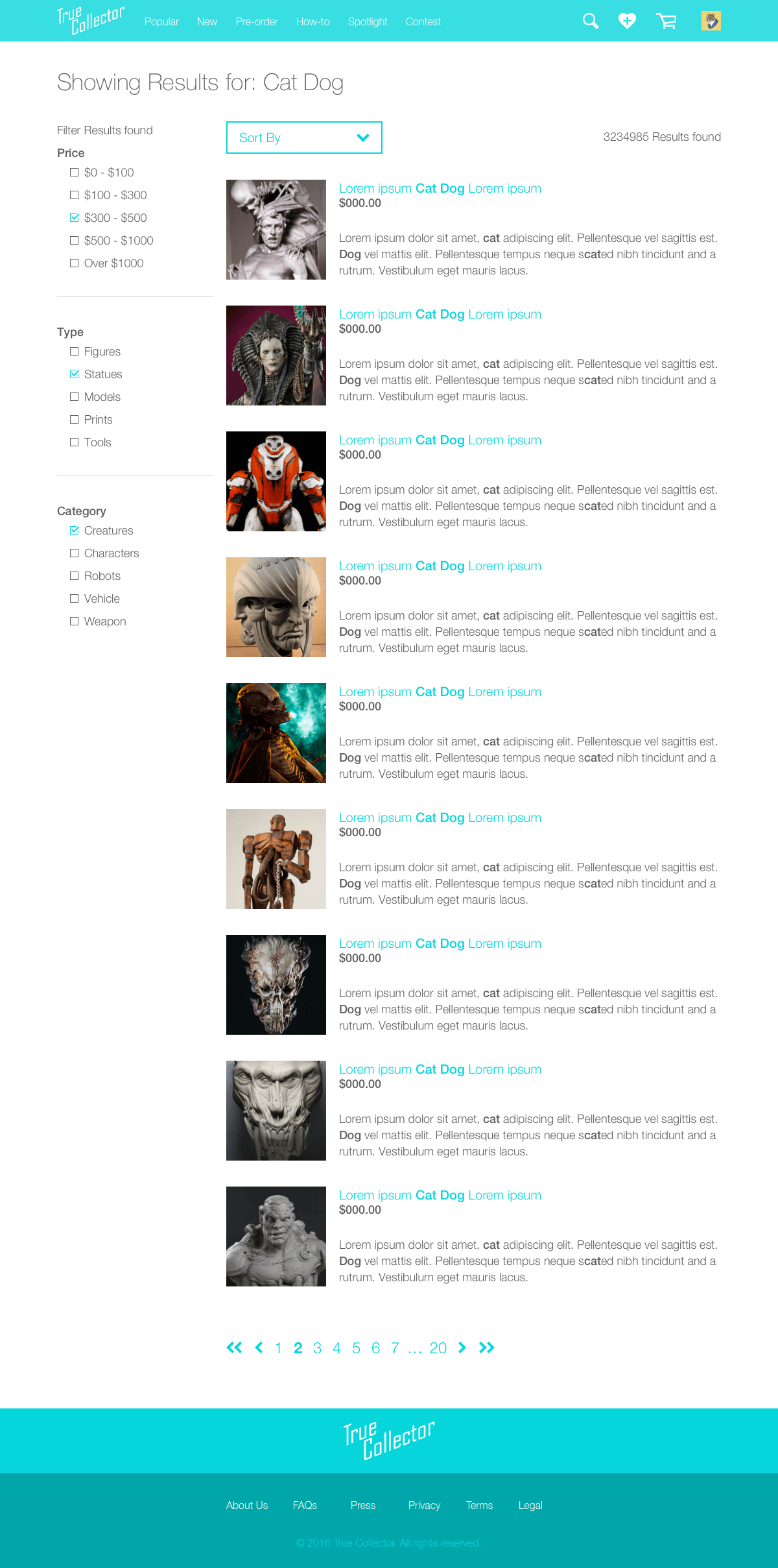
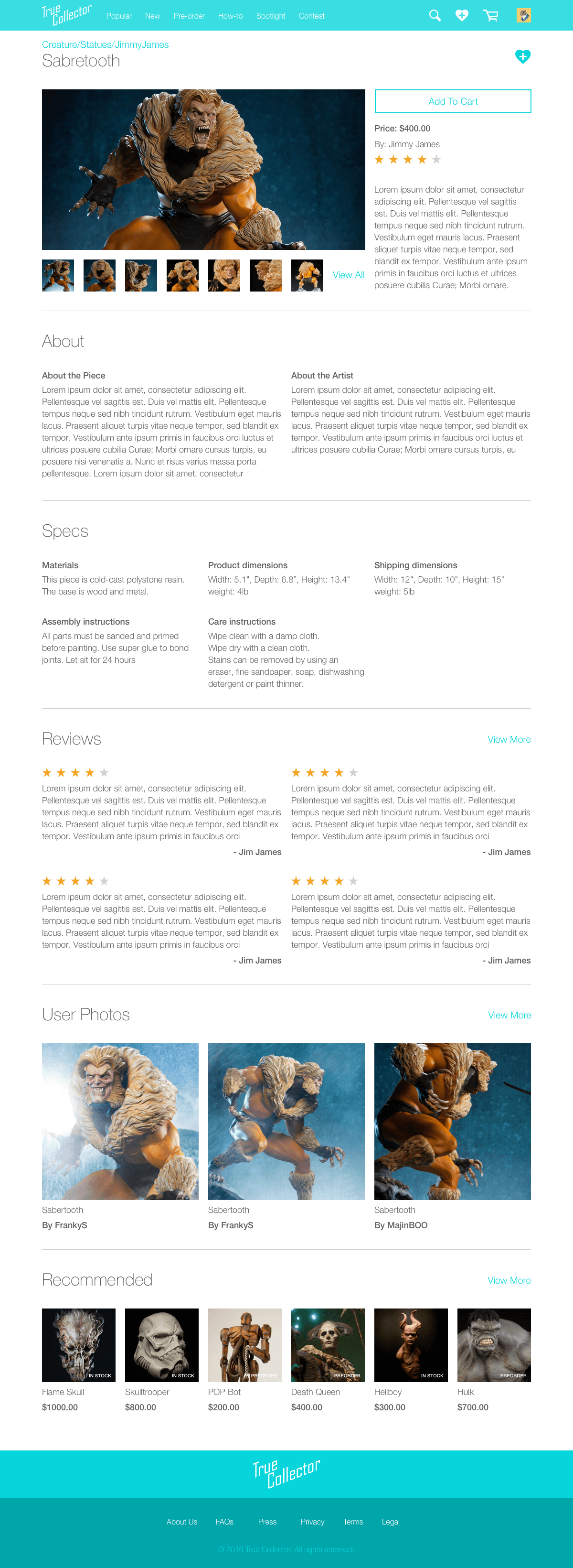
I’m a collector who cares about the craft as much as I care about the piece. I do a lot of research before I buy. I care about who the artist is and what motivates them. I want unique pieces for my collection. I want a shopping experience that is clean and to the point without overloading me with information that is not relevant.
Main Use case: Mobile
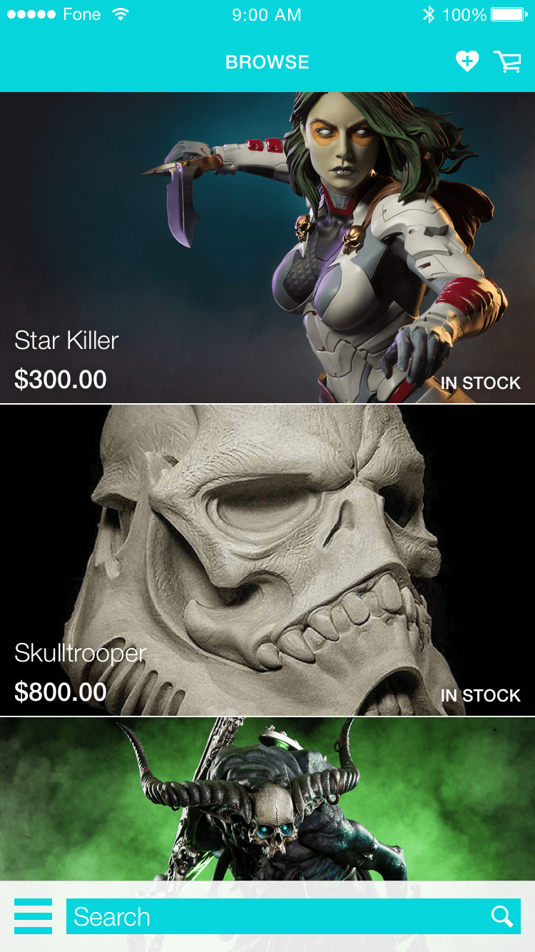
I’m a collector with a high interest in seeing all the items sold on True Collector. I want to browse on the go and want to look at interesting pieces. I might buy, but I'm mostly here to look and have fun.
Desktop
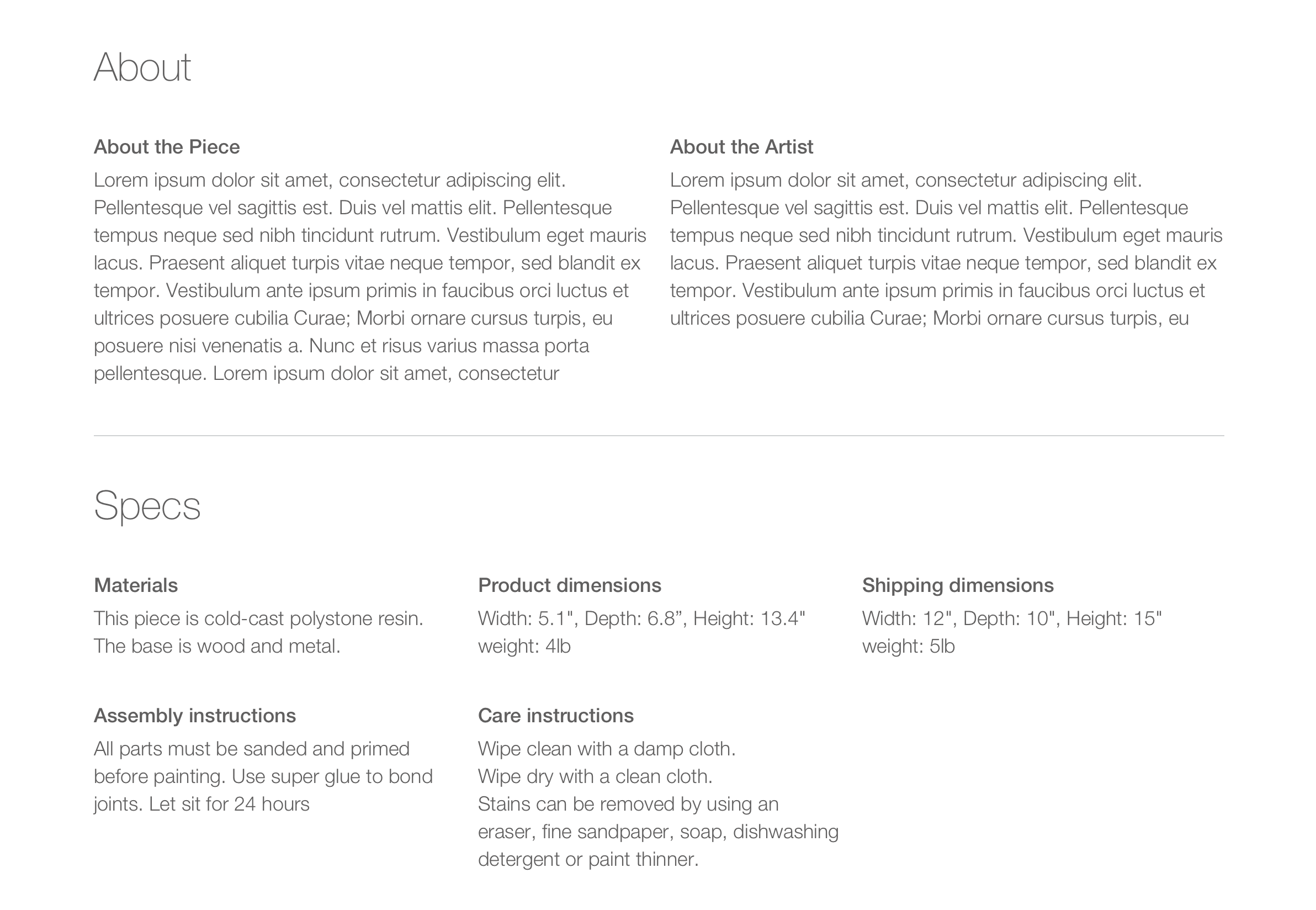
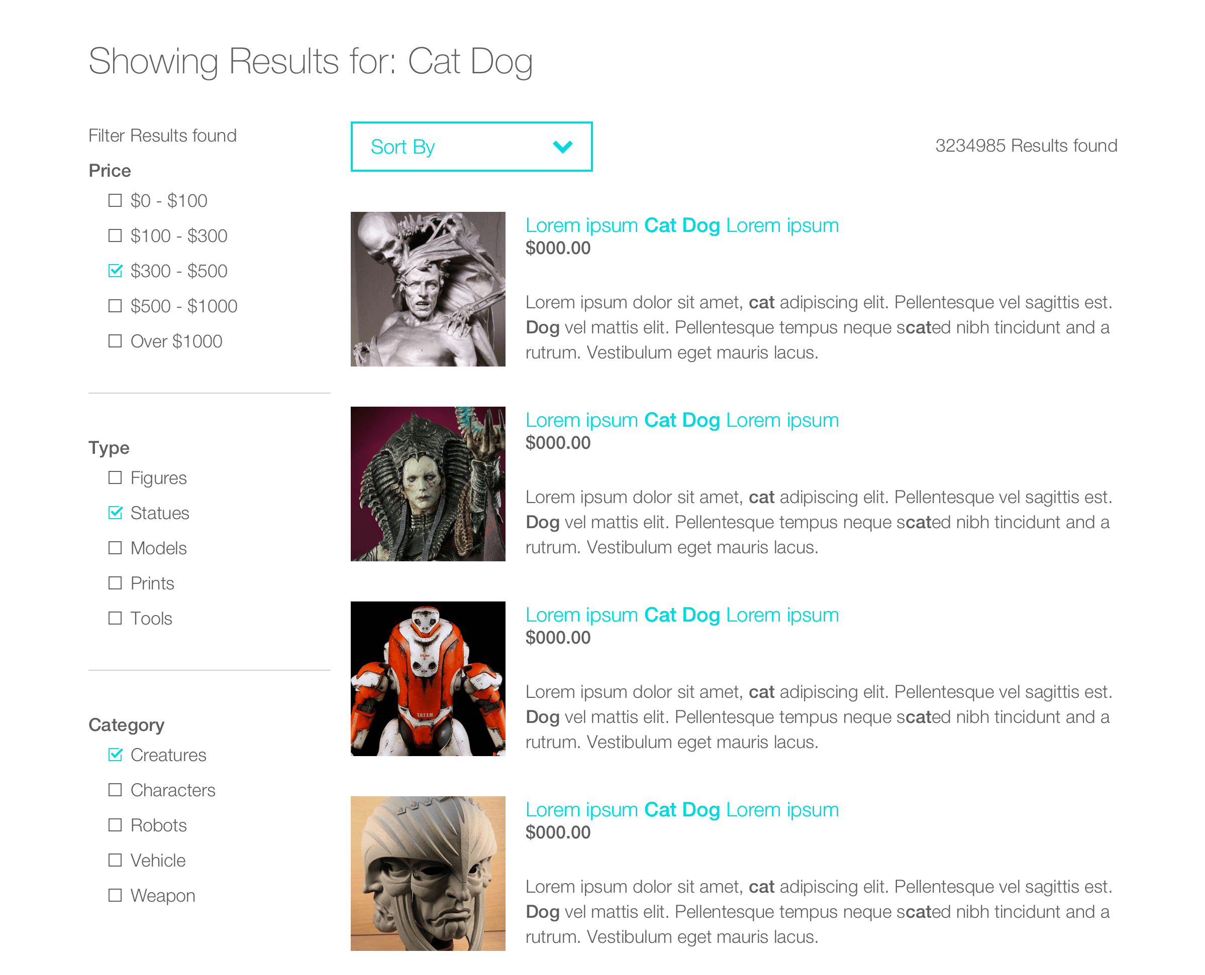
The desktop site focuses more ease of use and providing useful information. The user is looking for great pieces for their collections and to want to be fully informed at all stages during the shopping process.
Highlighted content
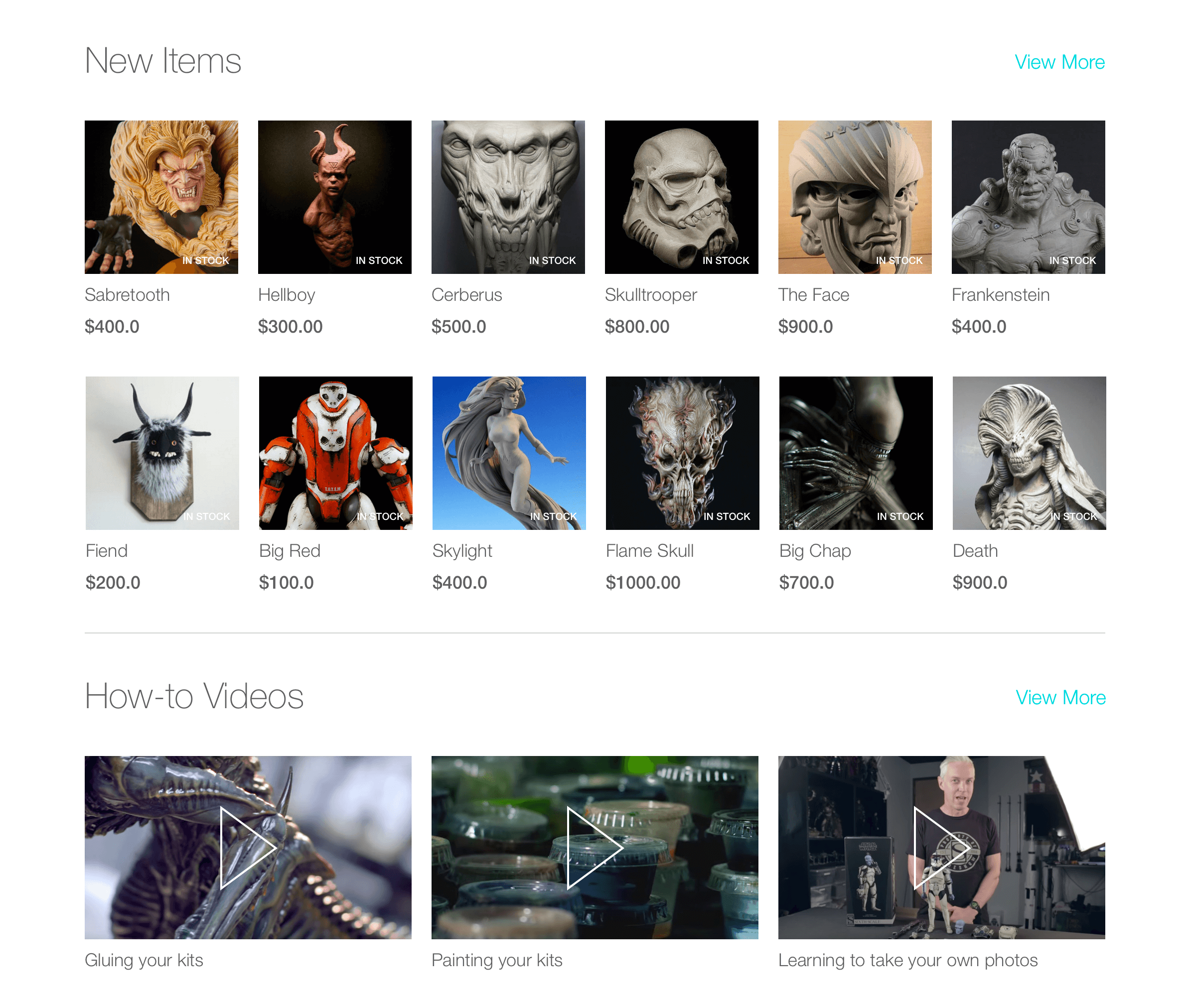
The landing page has different types of content for the user. These are sections that are most useful to the user’s experience. The New Items section shows the user what the most recent products to the site are. The How-to Videos give a lot of useful information to the user, like how to paint, glue or proper care instructions for pieces in your collection.
Mobile
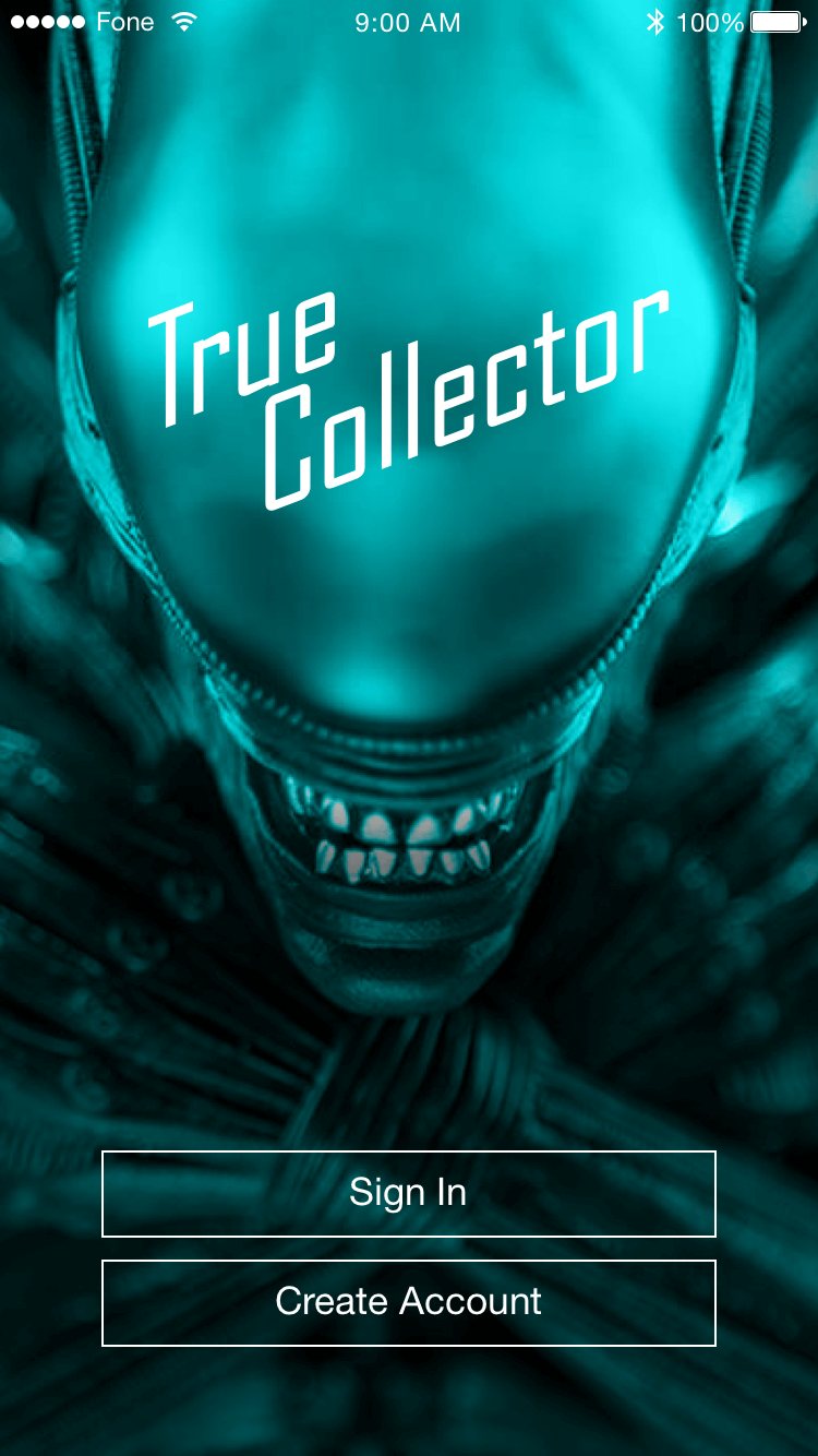
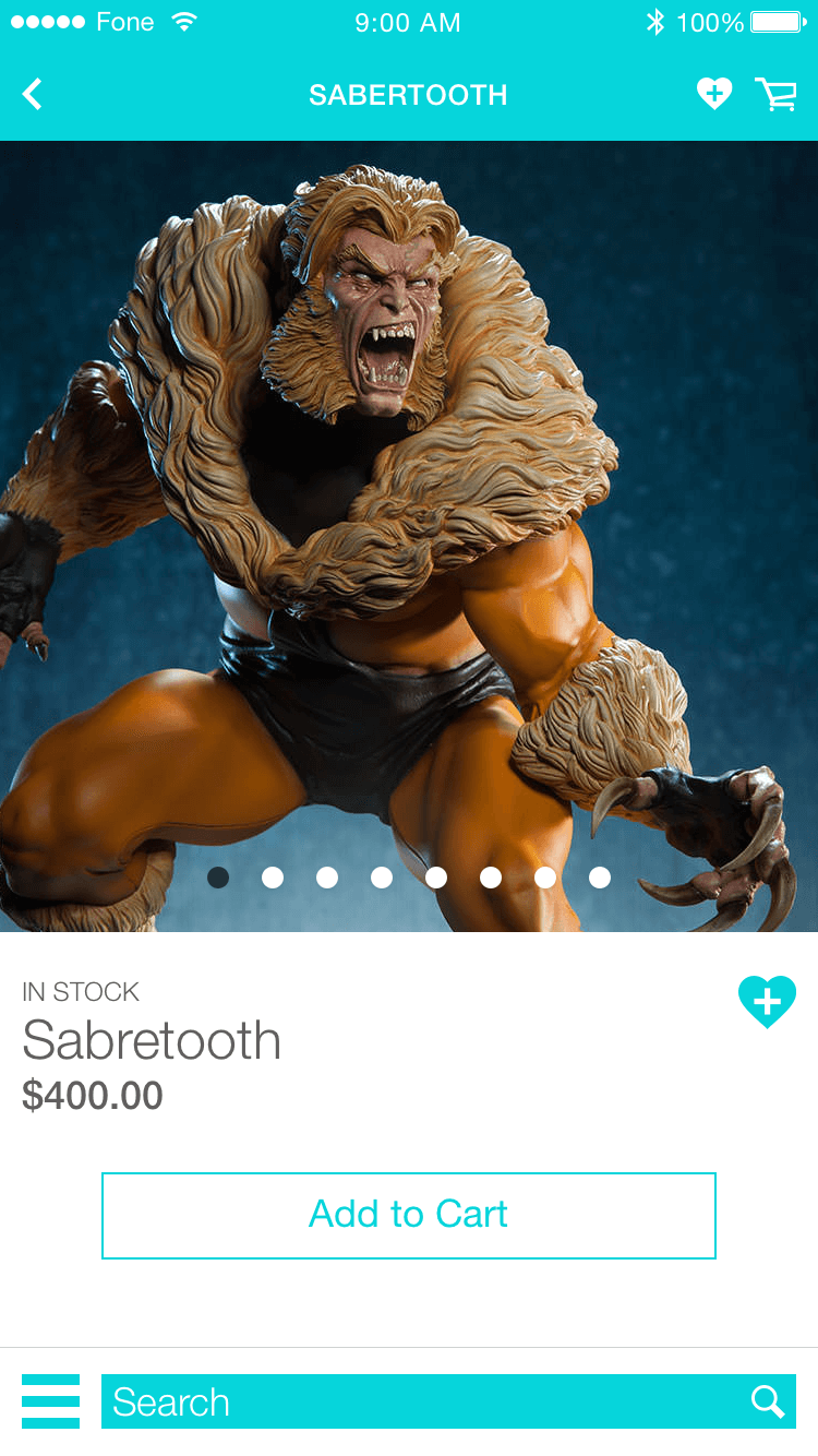
The mobile site focuses more on presenting the content in a way that makes for a good browsing experience for the user. This is more of a window shopping type of experience for the user when on mobile.

