Boardvantage
Meetx App
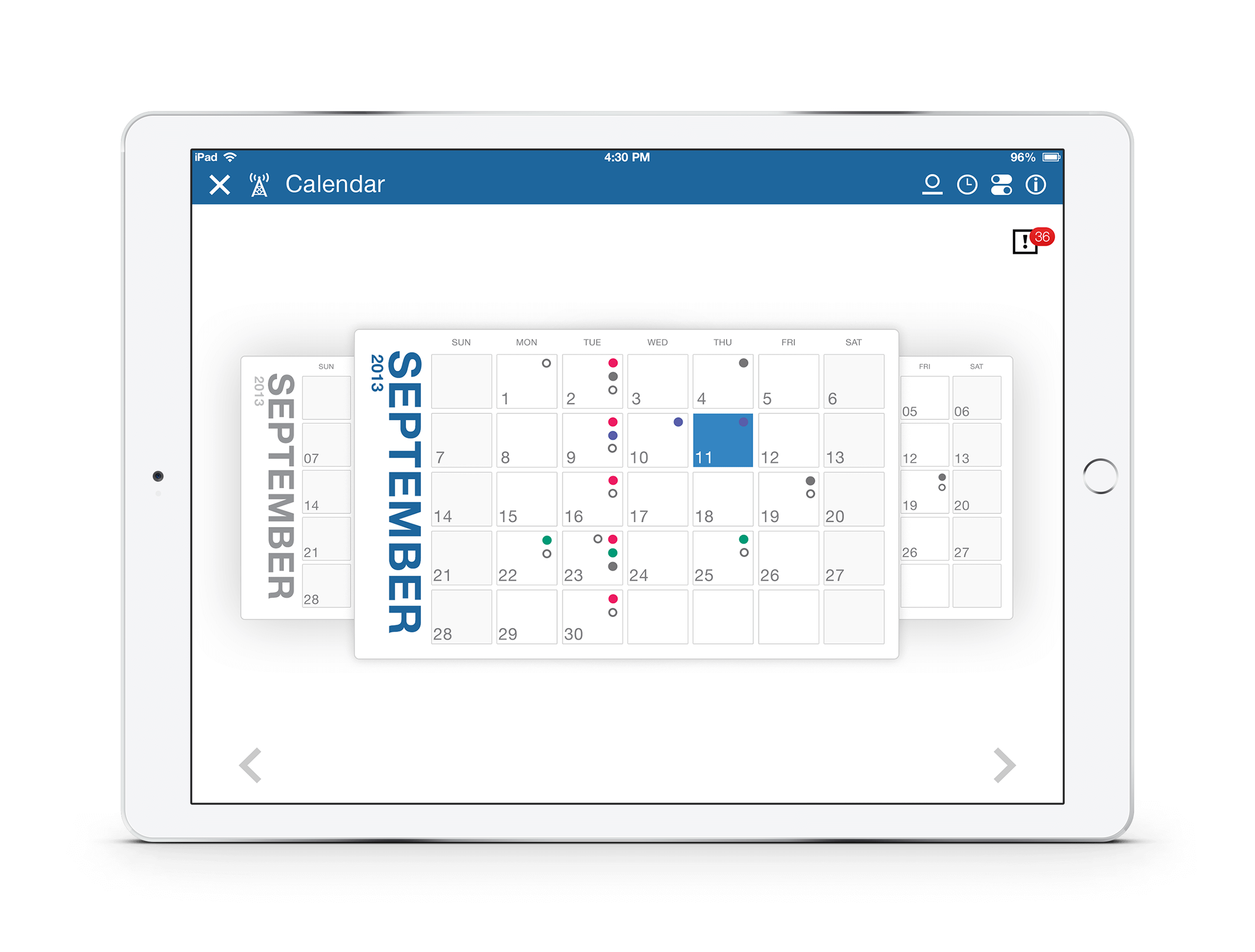
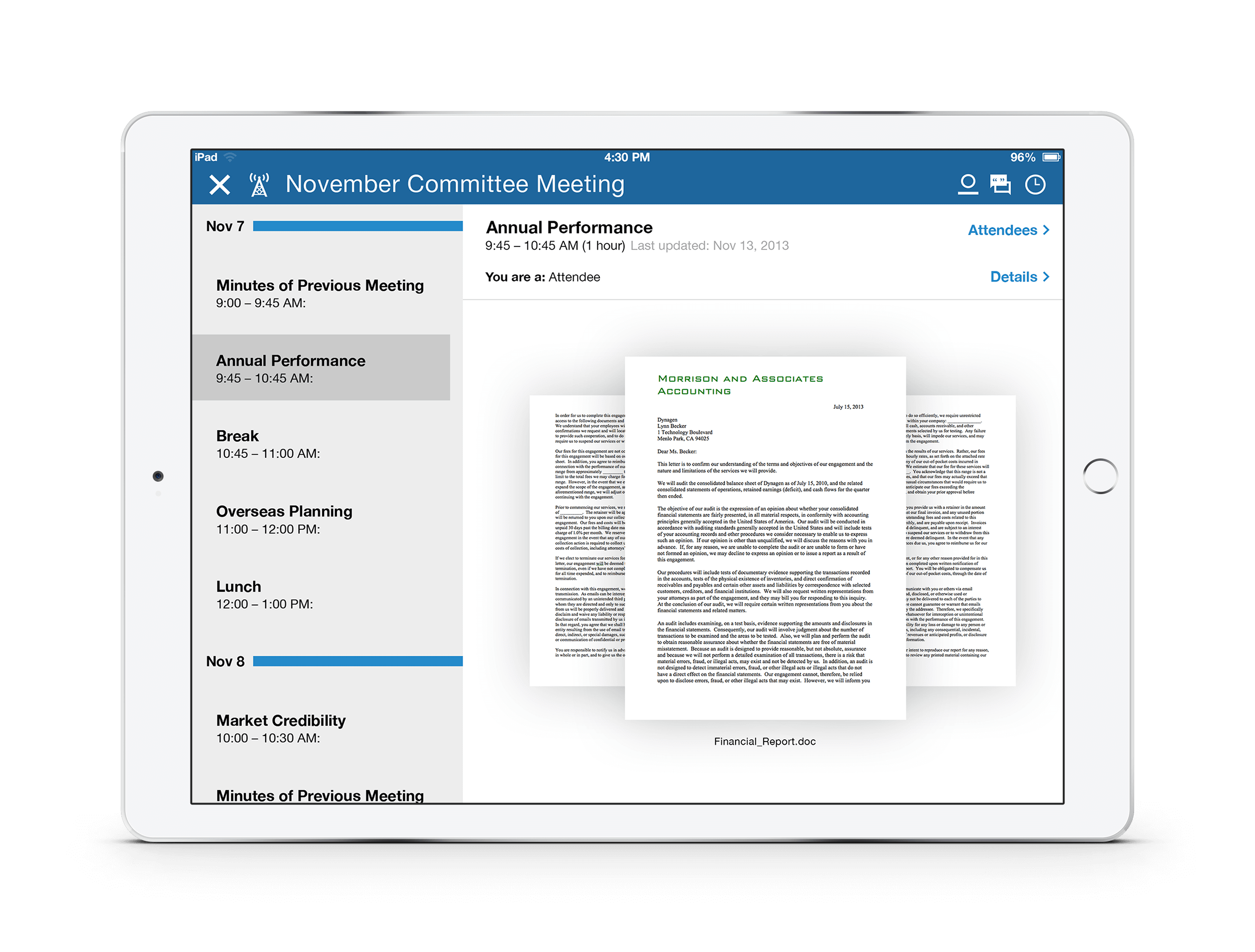
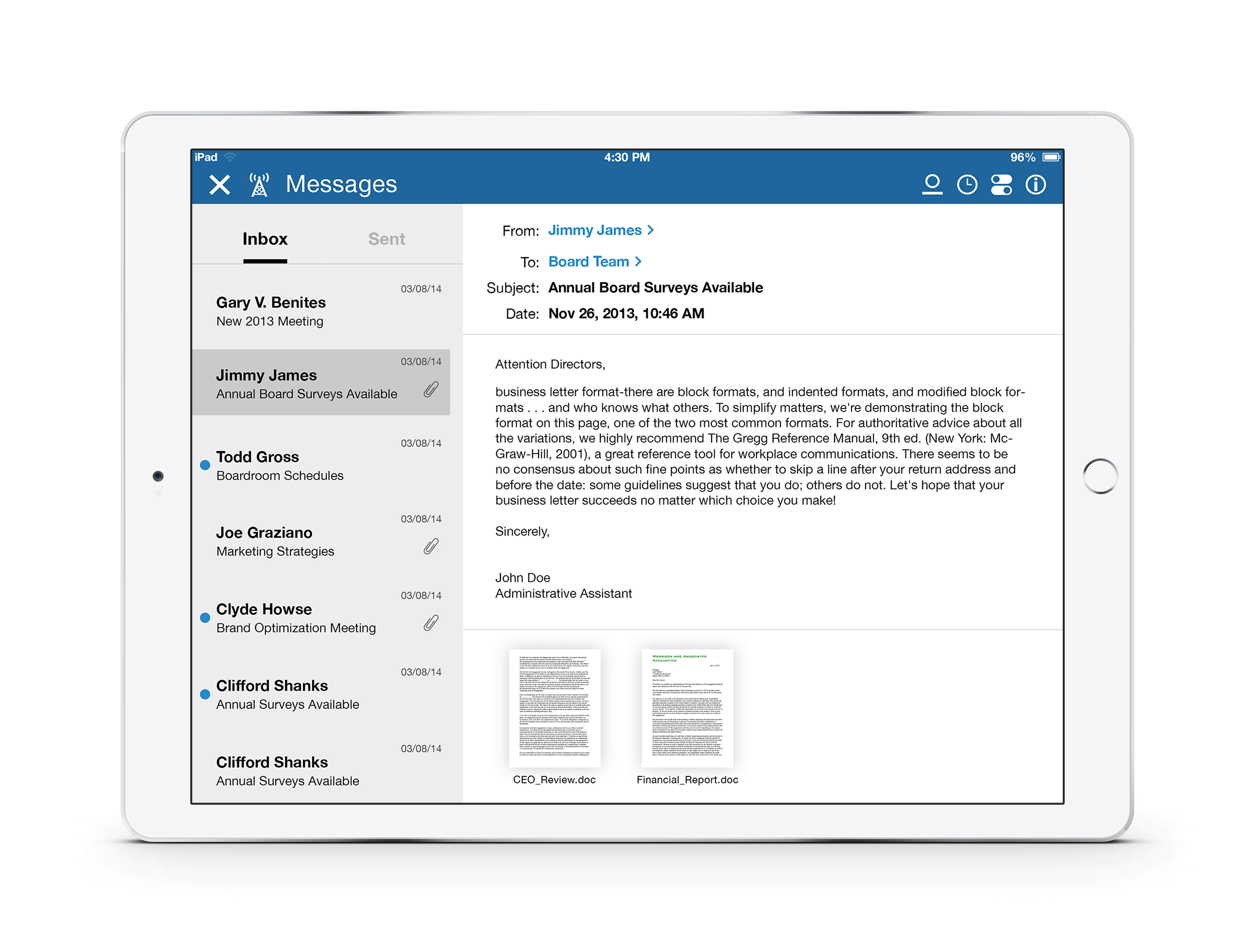
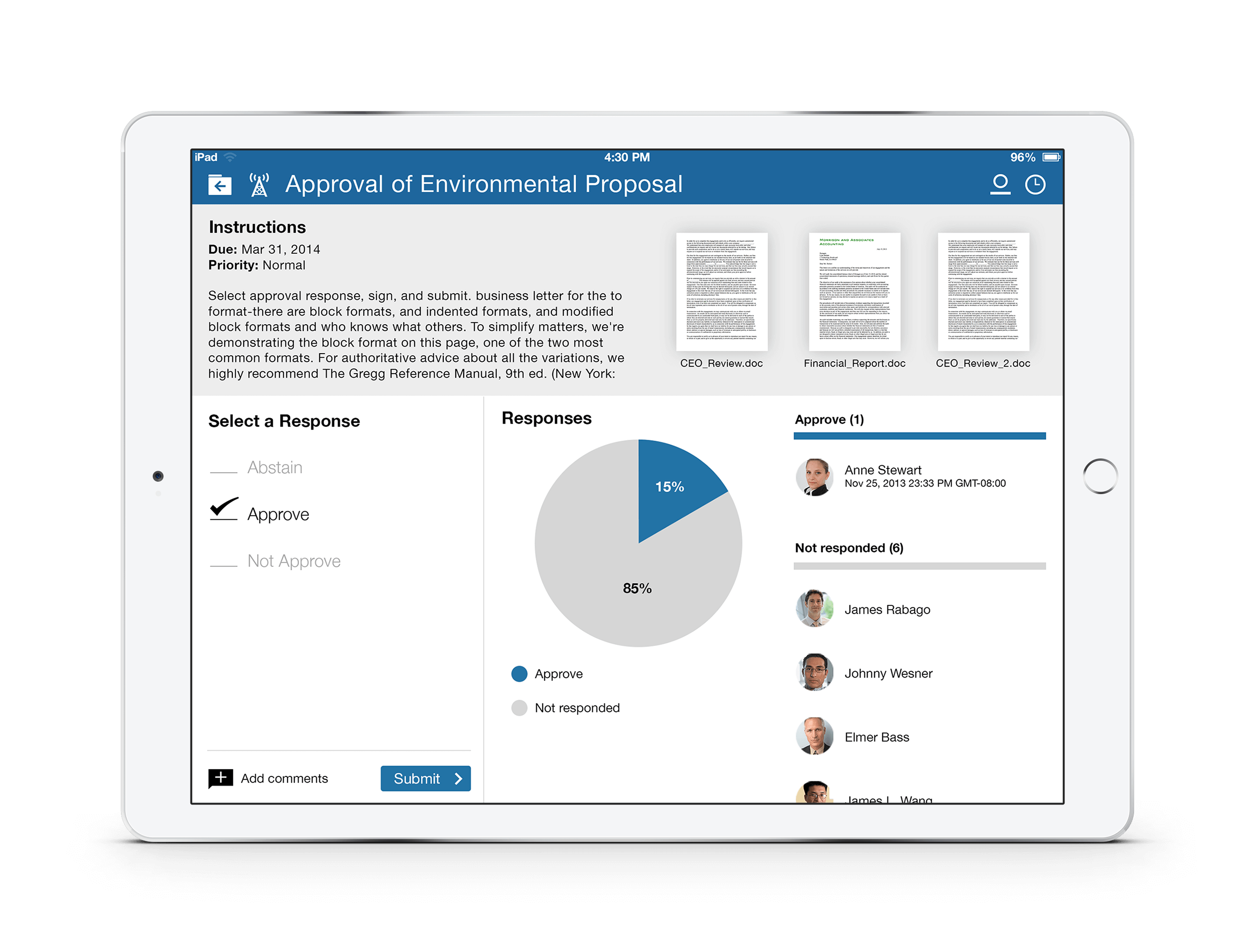
Meetx is Boardvantage’s flagship application. I designed the app to be clean and simple to navigate. It functions as a paperless boardroom. What this means is a user can do all the different things they would do in any board meeting right on the app. This includes document viewing, messaging, surveys, signing documents, driving meetings and much more.
Landing page
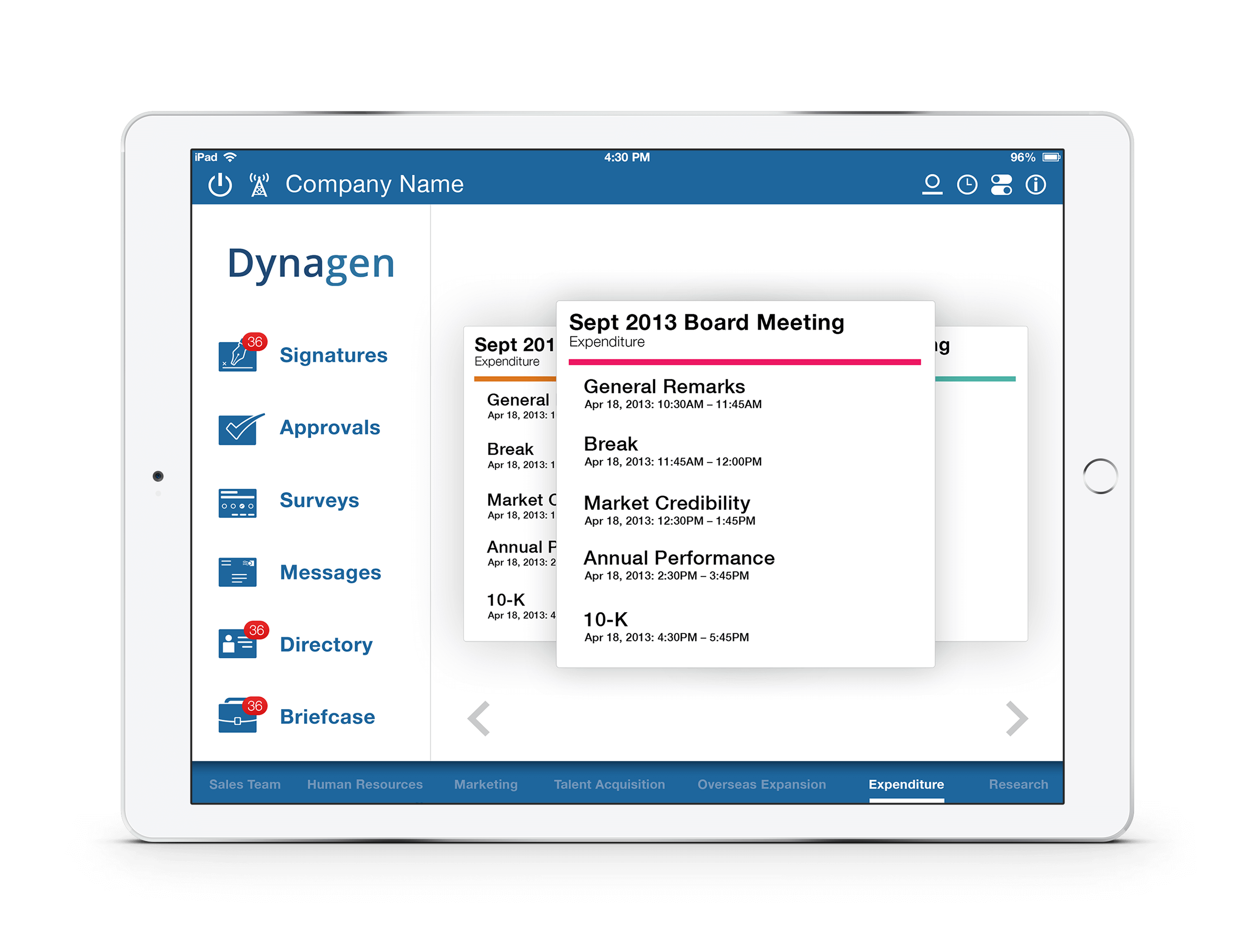
From here the user is presented with all of their different meeting functions. On the left, you have a branding section and available modules. On the right, you have a carousel with all of your meetings. This view gives the user a very easily digestible picture of what their schedule looks like and what they need to complete.
Surveys
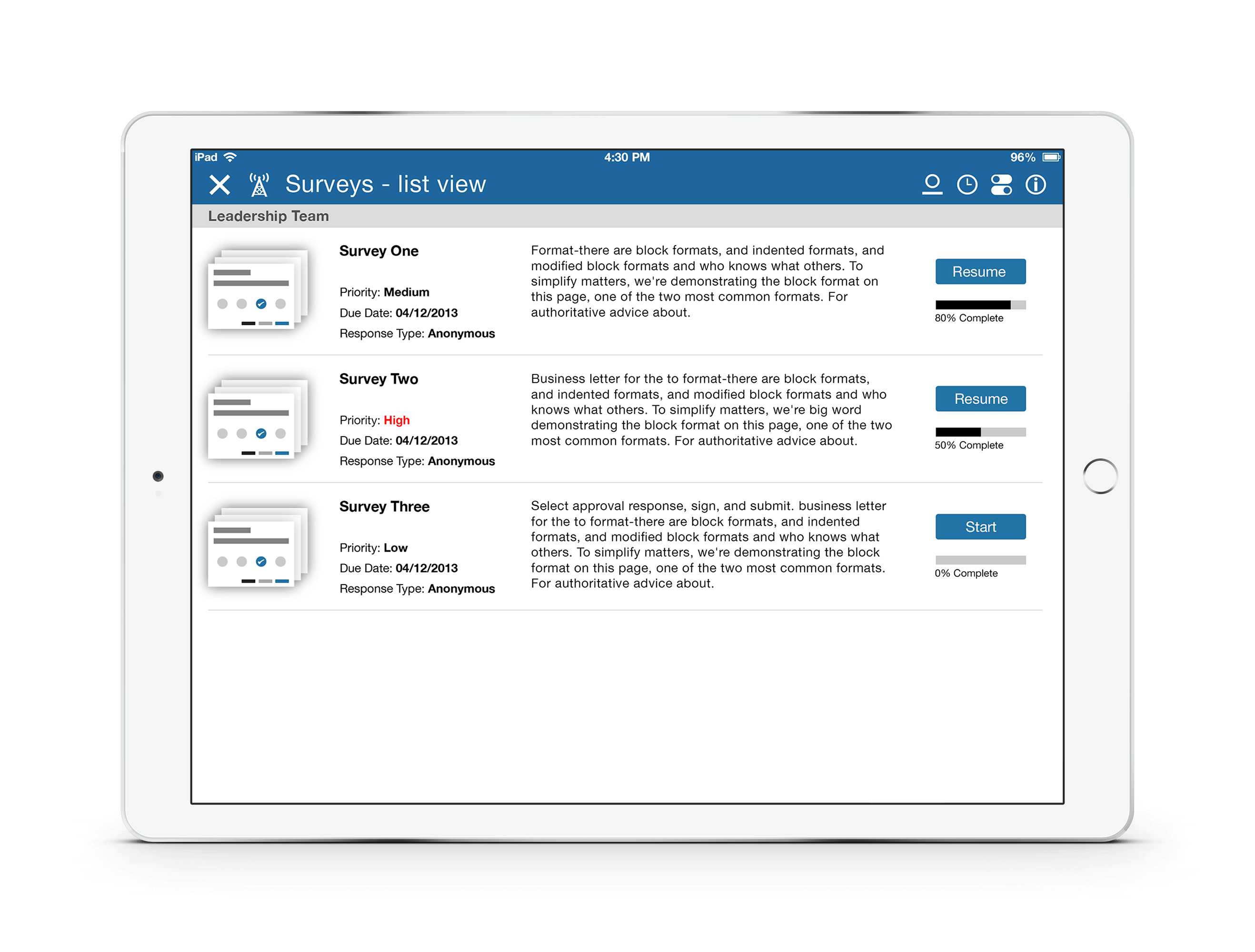
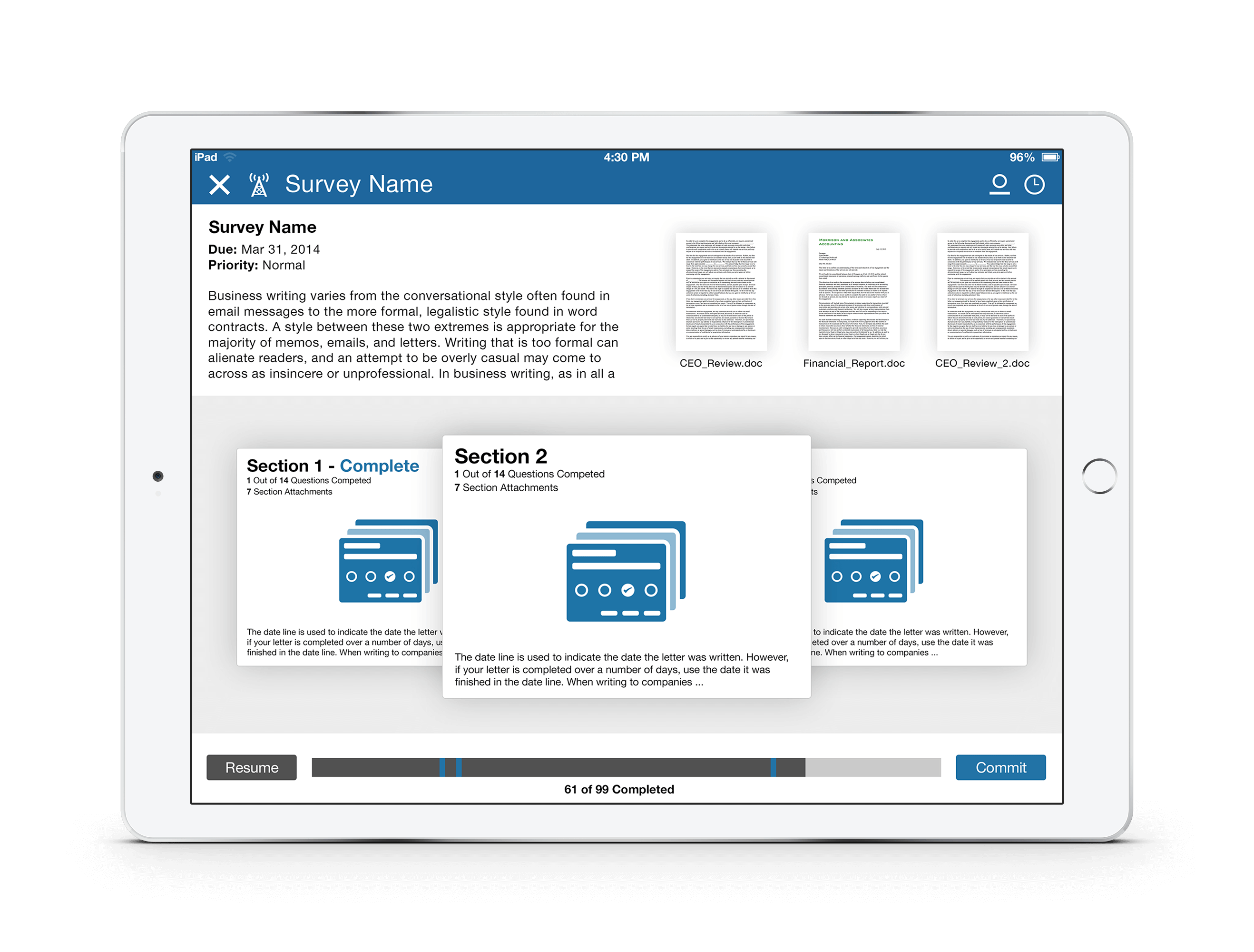
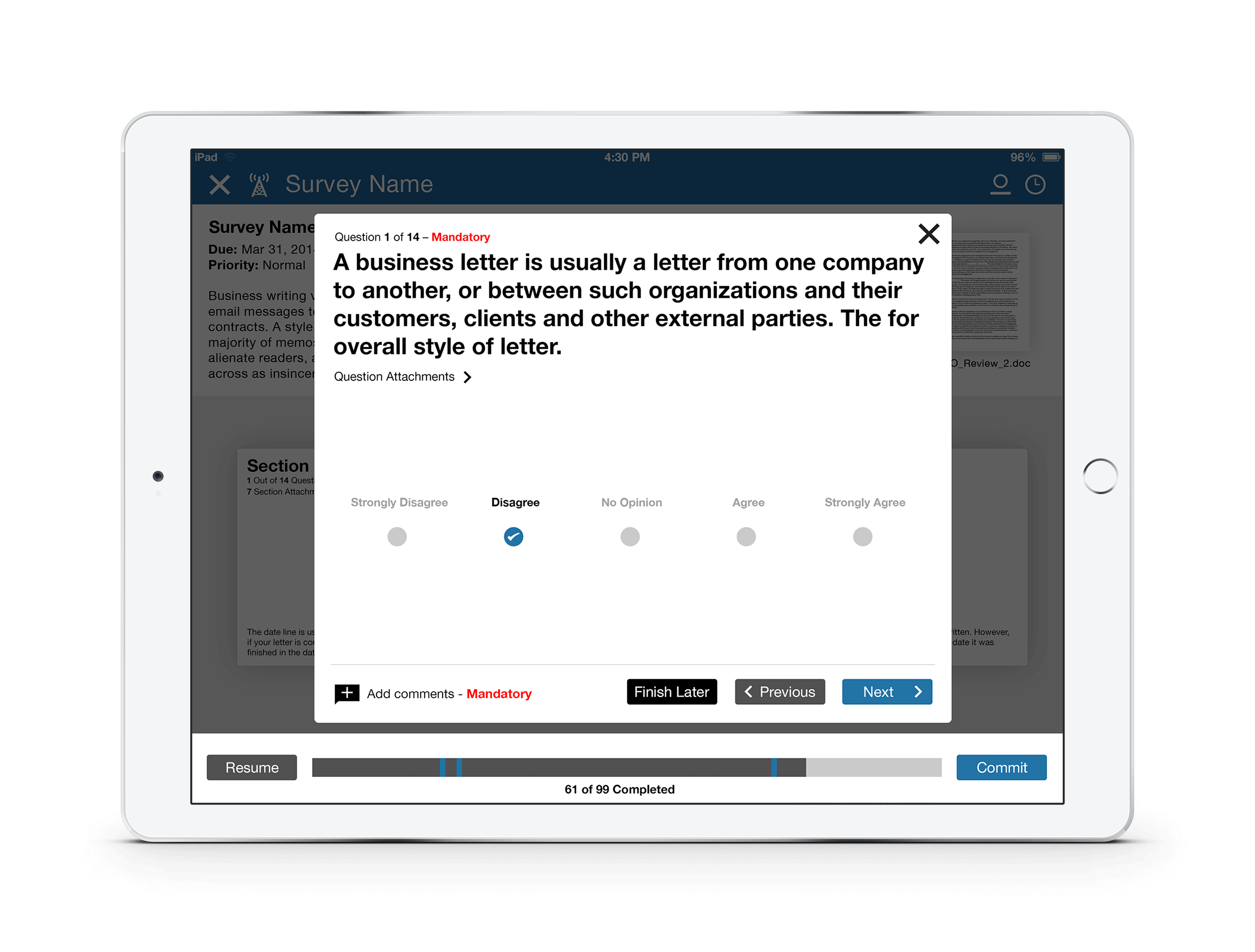
Because of all the functionality available in the surveys module, the design had to be able to present a lot of information, but still be clean. Here you can see some of the different steps within the survey experience. I wanted the user to have a clear sense of where they are, within the context of each survey.
